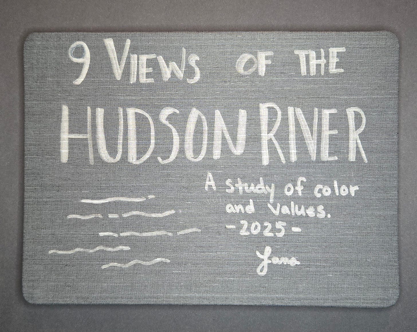
9 Views of the Hudson River
"A study of hues and values."
This year I finally managed to pick up the pace, taking classes and fitting in a little more time for art.
In addition to attending the weekly sketch group, I also started a weekly zoom art meetup with family members. This has helped with additional accountability, and also has created a built-in time to practice.
Since I shared by first sketch group book last week, I thought I’d go ahead and post my second one as well, which I just recently finished.
2025 Sketch Group Book
The theme for this next book was “Portraits” and we all used the Hahnemühle The ZigZag Book - 5.8" x 8.3", 18 pages. Only a handful of people ended up actually drawing portraits… the rest of us morphed the theme to be something like “A portrait of…” fill in the blank. I wasn’t ready to take on sketching faces, so I created “A Portrait of the Hudson River.”
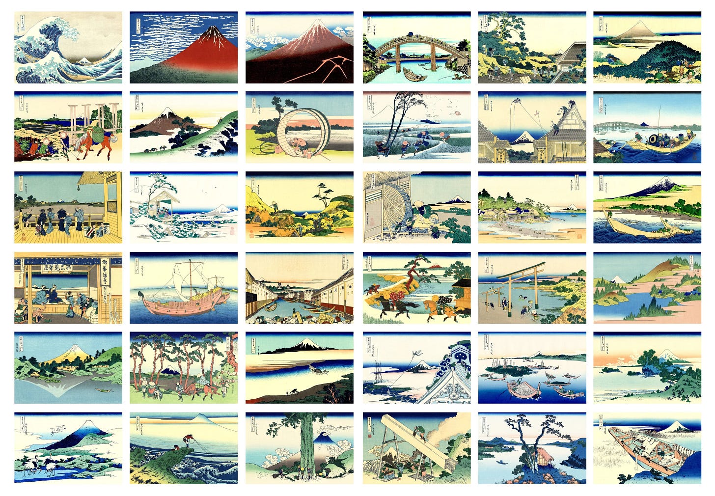
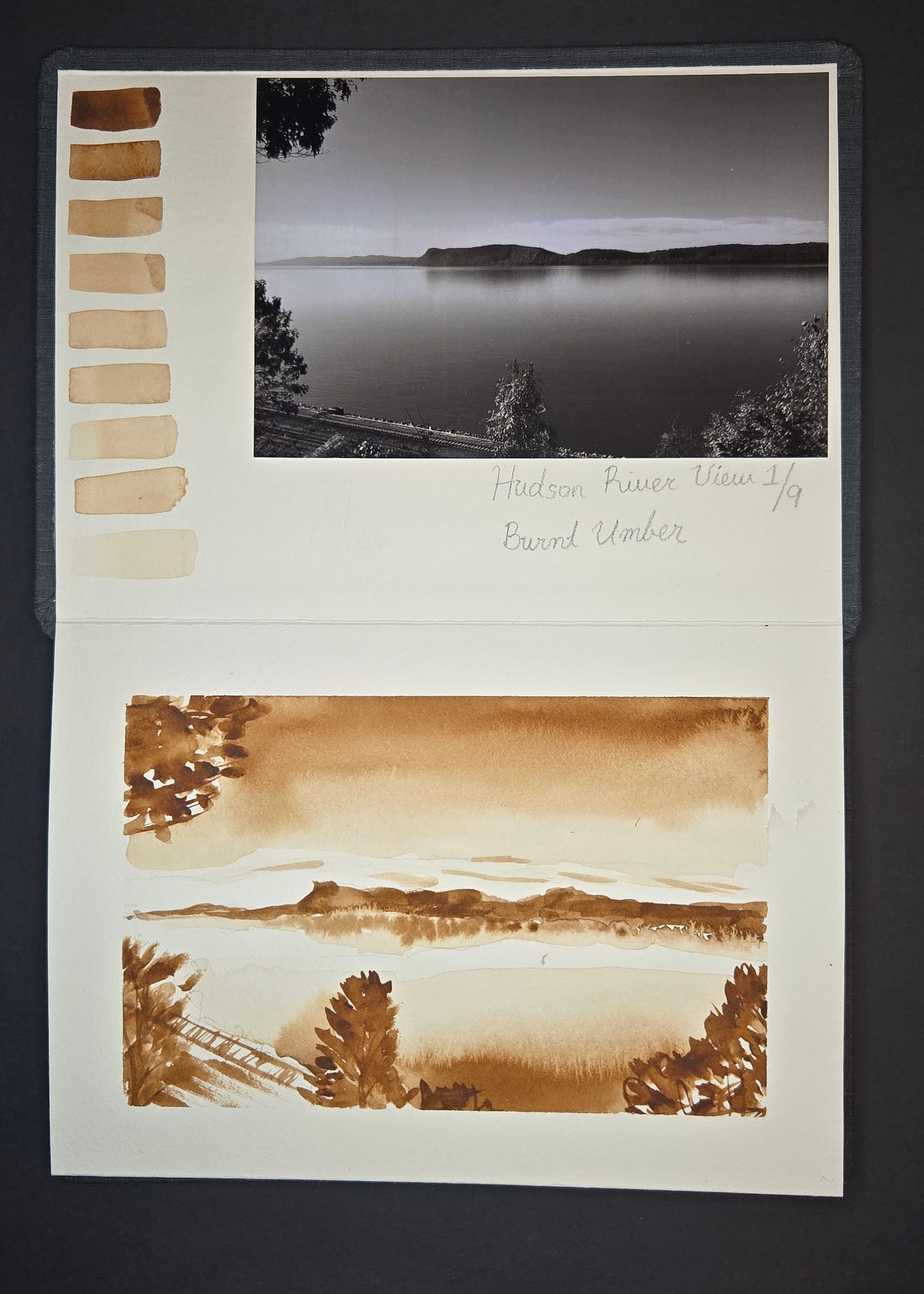
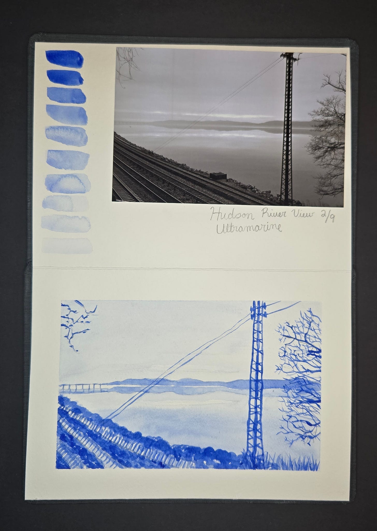
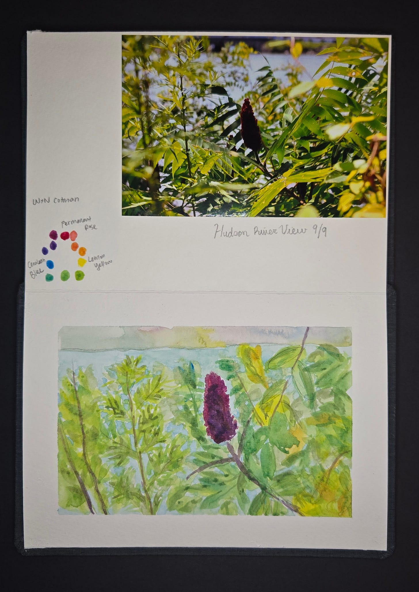
I took the idea from Hokusai’s 36 Views of Mount Fuji. Some of his prints feature Mt. Fuji prominently, while others you can only see a sliver of it in the background. Since I have many photos of the Hudson River, I decided to take my own photographs and work from those. I chose nine photos in order to create double spreads in the book - one page would be the photo and color practice, the other page would be my sketch.
Based on Shari Blaukopf’s “Expressive Triads” course, I decided to give myself a few practice parameters and make this book a study of colors and values. I learned after the fact that I did it incorrectly (oh well!) but it was still a good experience. I actually hope to do the entire book a second time and will keep you posted if I manage to make that happen.
For the following project I used:
Hahnemühle The ZigZag Book - 5.8" x 8.3"
Winsor and Newton Cotman, student-grade watercolor paint
Cover
My idea was that I would do three sets of images.
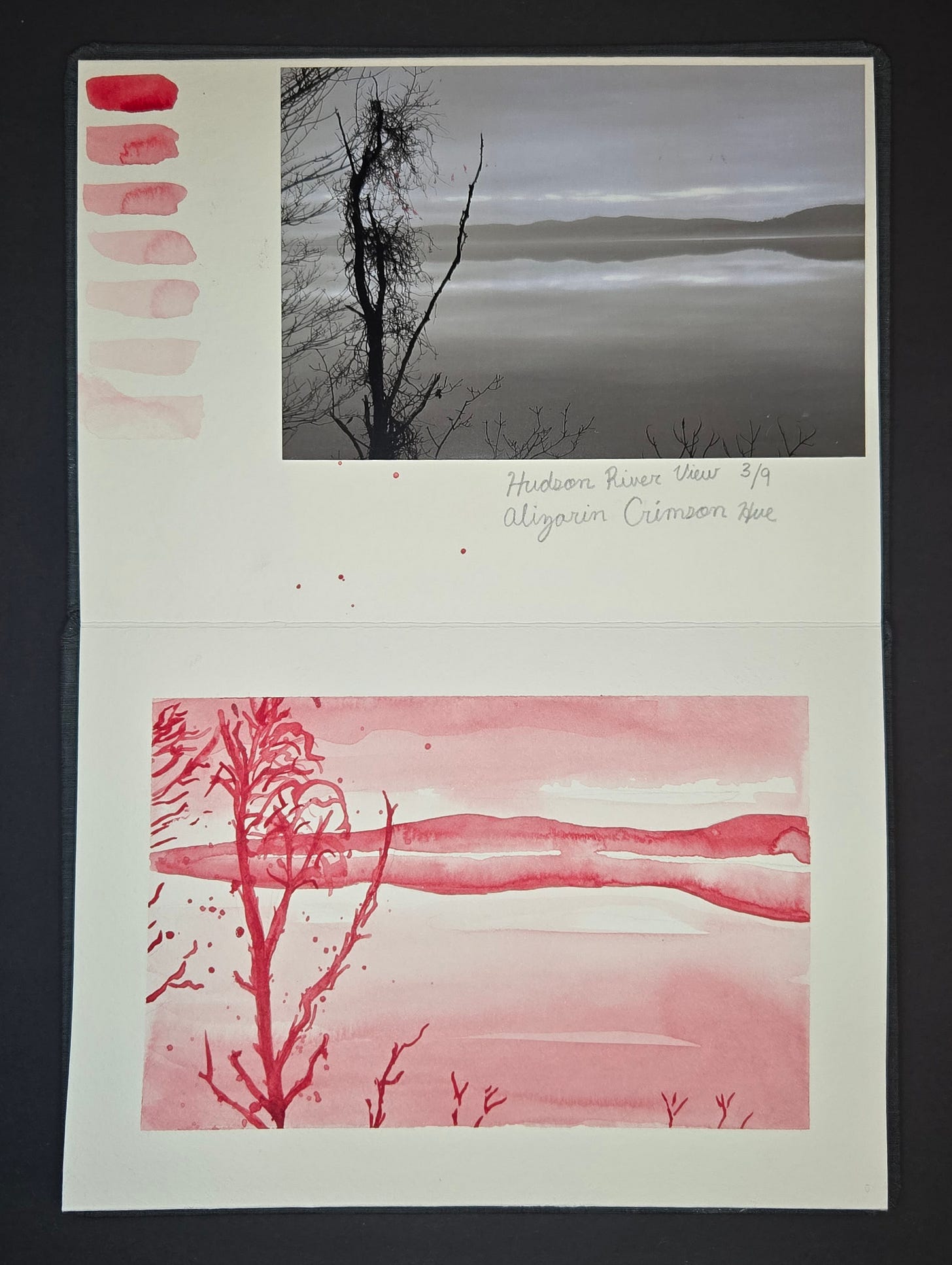
3 sketches - monochromatic
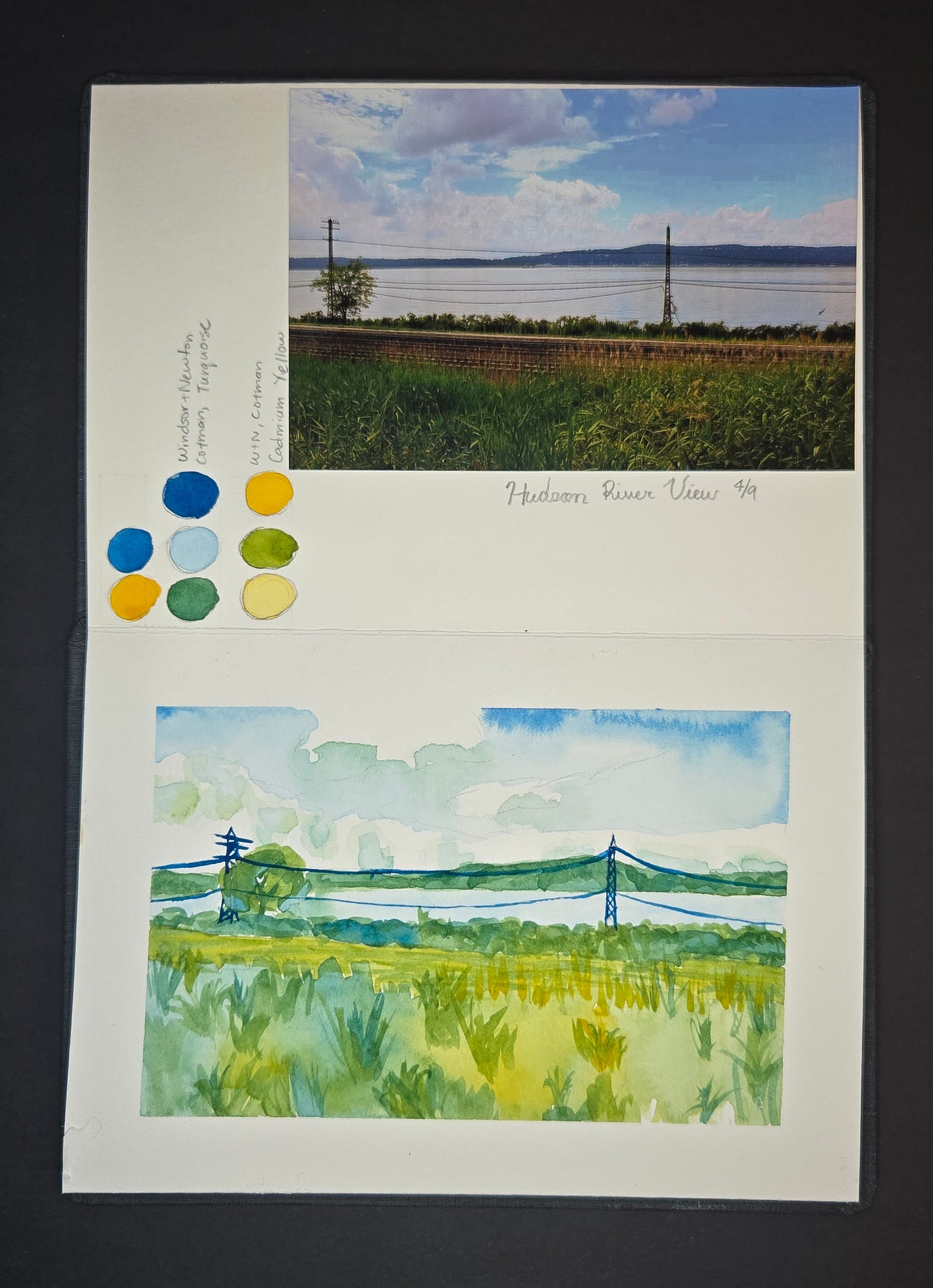
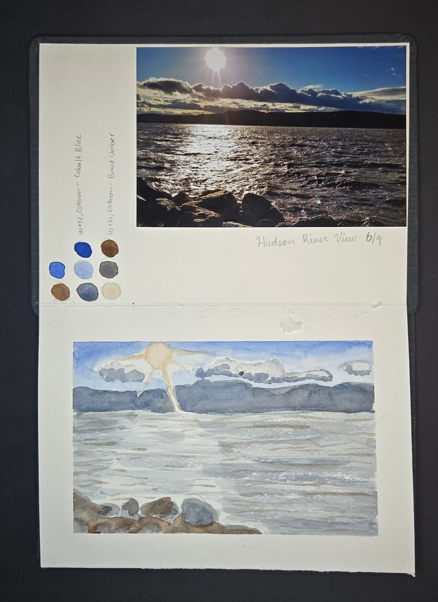
3 sketches - use only two colors per sketch (mix to create a third)
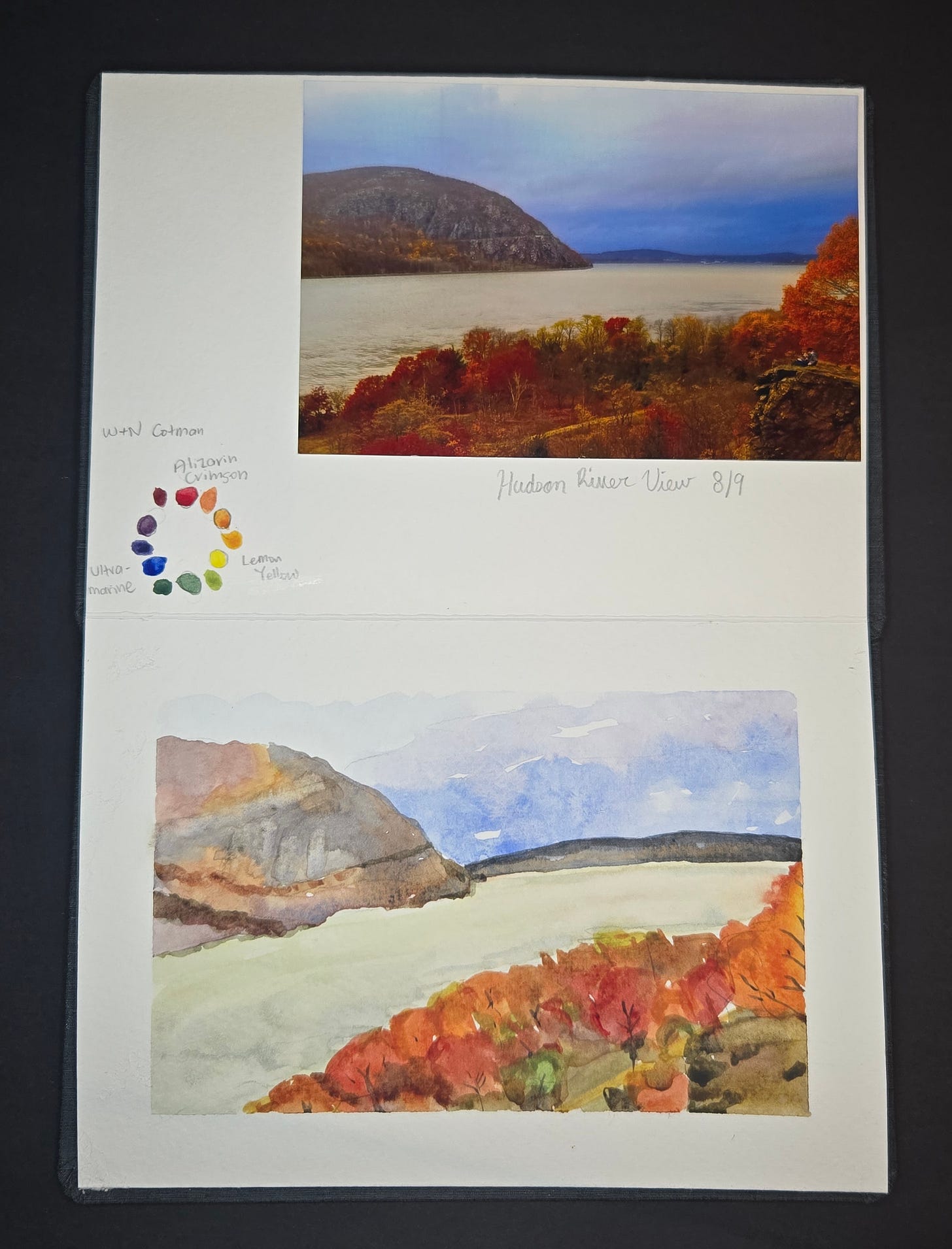
3 sketches - use only three primary colors per sketch (mix to create the rest)
In the first three sketches I intended to practice values, however, a teacher later told me you have to go from white to black, not only lightest to darkest of the same hue. So I couldn’t achieve this unless I added black or another pigment that would create this range.
1 of 9 - Burnt Umber
2 of 9 - Ultramarine
3 of 9 - Alizarin Crimson
4 of 9 - Turquoise + Cadmium Yellow
5 of 9 - Ultramarine + Burnt Sienna
6 of 9 - Cobalt Blue + Burnt Umber
7 of 9 - Permanent Rose + Cadmium Yellow + Cerulean Blue
8 of 9 - Alizarin Crimson + Lemon Yellow + Ultramarine
9 of 9 - Permanent Rose + Lemon Yellow + Cerulean Blue
With this process I got to learn a little more intimately how the colors work on the page, and how they interact with each other. I also learned that I need to spend a lot more time making color swatches, color charts, and color wheels to get an even better sense for how this all works. Of course you don’t have to pursue the “science” behind watercolor to paint lovely images, but it feels like if you really want to dig deep and create specific paintings, it’s beneficial to know how the pigments are made and understand how they’ll interact with other pigments and why.
Thanks for reading,
-Lana
Original photographs and watercolor images property of LK © 2025.




Amazing lesson in seeing, color and water color. Thank you. I also love the Hudson River. Your sketchbook is a wonderful live letter.
I love looking at these. Thanks for sharing the process!